Time to Clean Up The Web

The web used to be a beautiful place. Those rolling pastures of fast loading simple HTML, the fresh smell of web 2.0 gradients, the spotless fields of minimal libraries. Sure, our navigation wasn’t as advanced as today, but the waters were clear and easy to surf.

Over the years however, an icological disaster of petaproportions has been unfolding. I’m talking about the wave of toxic trackers, social media plugin spills, poisonous popups, chemical cookie banners, and all the other garbage that has slowly turned the clear web waters murky. With January being the time for new resolutions and new ideas, let’s make this the year we finally start to take action, clean up, and make the web usable again.

There have been plenty of cool trends as well of course, but some have been one step forward and two steps back. Sure we got rid of some pop-up window ad dialogs, but only to find them replaced with exit intent popups, mouse cursor heatmap trackers and being tracked on every page by FacedIn and friends. It’s making the web unreadable and we should fix it.

Let’s look at some examples of web pollution. Some are so hilarious it looks like parody; how I wish that was true (nothing’s photoshopped here!)

Cookie bar

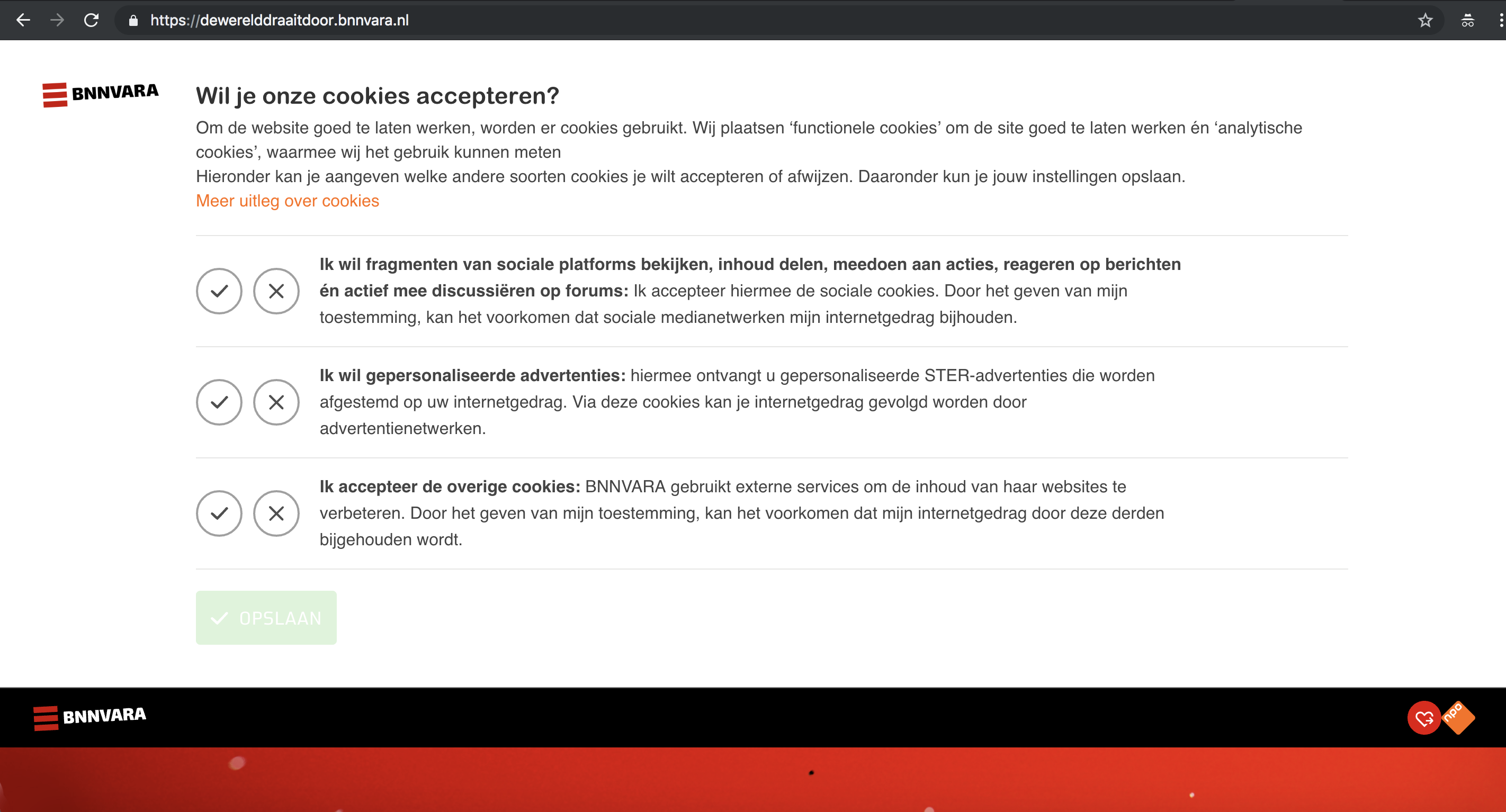
This is an example from the Dutch public broadcaster. It doesn’t matter what is says (yes it fills the entire screen, you need to click all buttons, and it looks like a website to configure the internet, doesn’t it?). Our Crapbar Rating ™: 4/5.

This is the plastic bag of web pollution. It’s simply everywhere. While it has done nothing to stop data collection (obviously cookies are just one of the many tools for tracking), it sure did make it more annoying. Some types of cookies don’t even require a pop-up (a privacy policy in the footer is often fine), and regulators certainly didn’t specify a minimum in obnoxiousness. That doesn’t seem to stop many websites from showing a humongous crapbar covering the whole page. It’s even more pointless because many sites load the cookies anyway and the crapbar just informs you they’re doing so, while the whole point was asking consent.

GDPR

Death by crapbar

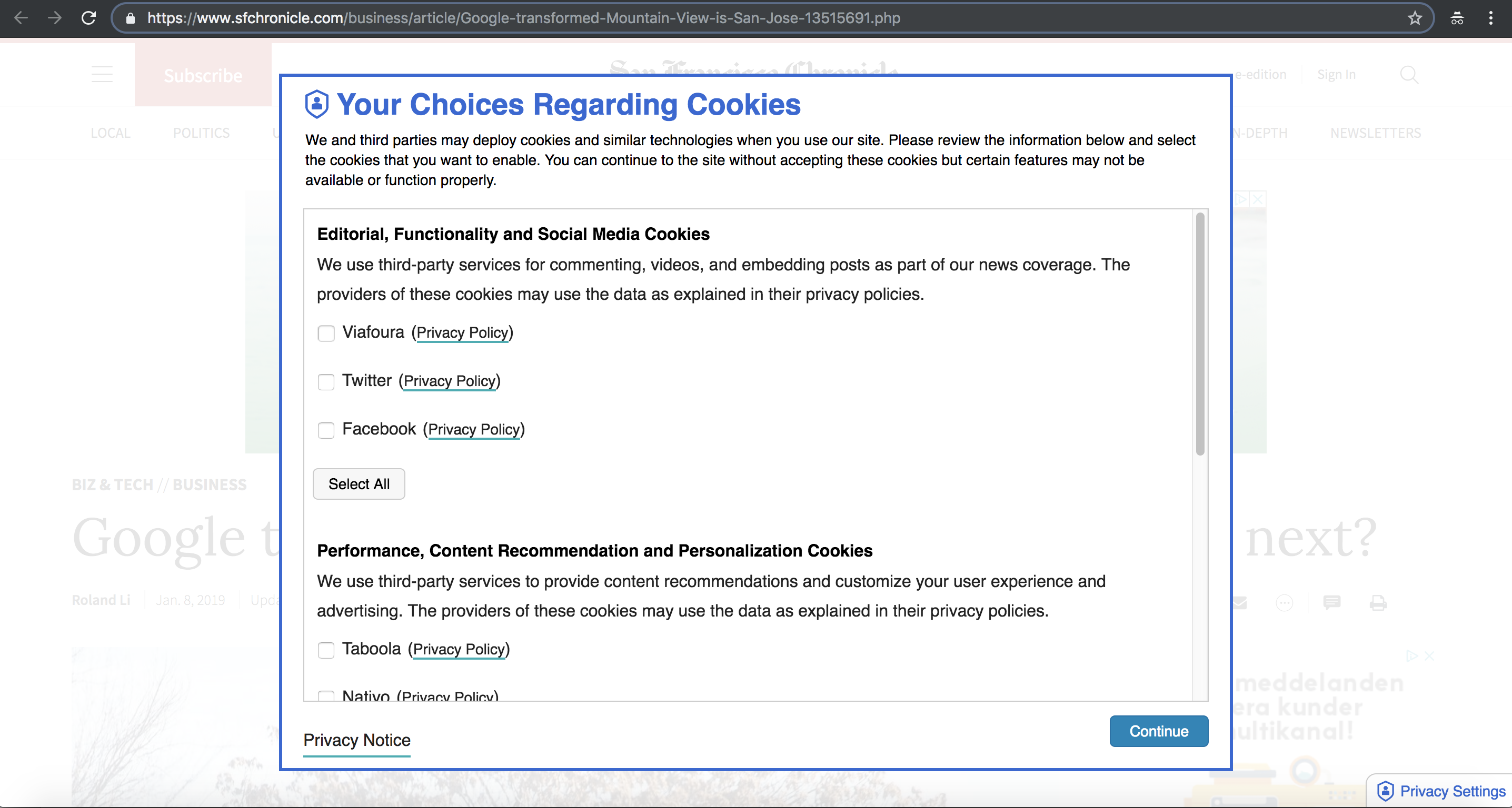
Like the cookie crapbar, its friend the GDPR crapbar, pop ups in most places these days. Don’t get me wrong, the idea behind GDPR is great: respect people’s privacy. In practice, however, that often means don’t change anything but just show even larger and more obnoxious dialogs. I also like how they give you all these options of trackers and ads to “opt-in” to. Who in the history of the internets has ever voluntarily clicked on any of those? If you know the answer already, just don’t ask. Ironically all these pop-ups have also made browsing in Incognito mode or Firefox containers, handy tools to prevent tracking sessions, completely unworkable, with more tracking as a result.

The Cookie + GDPR double-whammy

This GDPR crapbar is so large, that the cookie crapbar on top hides the underlying GDPR consent button, which you would have to click to continue (but can’t). Good Times. Crapbar score: 5/5.
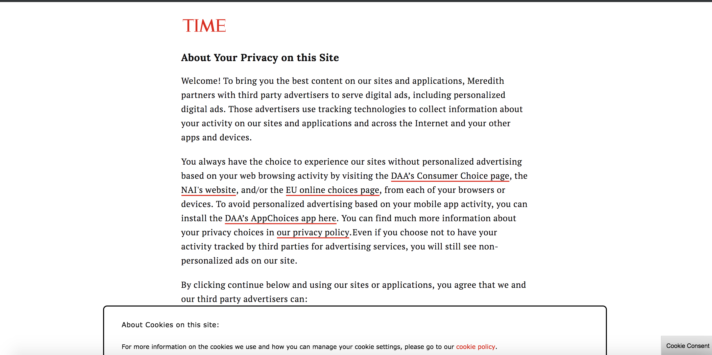
Visual noise

Pardon the interruption, 3 crapbars per paragraph.

A polluting trend that can’t be recycled quickly enough as far as I’m concerned, is adding all kinds of sticky bars and things that pop-up while reading and scrolling. In the example above there’s not a whole lot of room left for the actual text between the slats. You might think I’m vertically challenged and should just get a larger screen, but people also read on laptops and mobile devices.

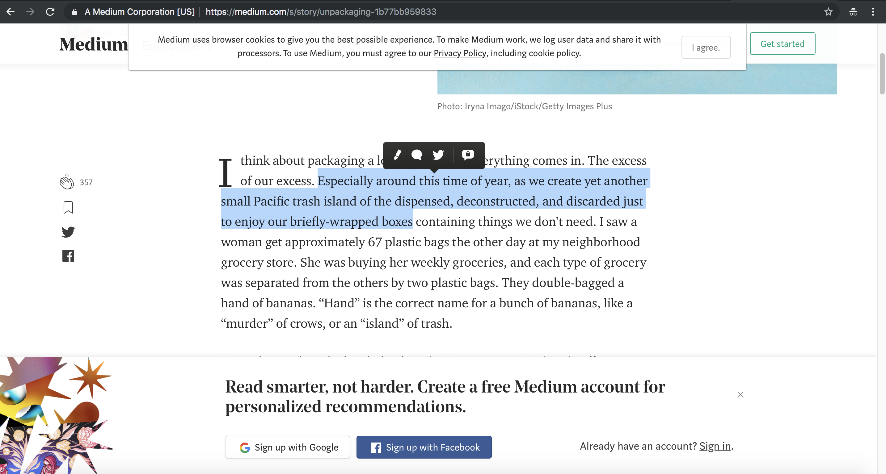
I also don’t get the trend of having to override selection behavior. Yes, I’m a selection reader, I select stuff while reading. And no, just like the rest of humanity, I have never ever clicked on the “Tweet this selection” button.

Another related web pollution trend is the exit intent popup dialog. There you are, casually surfing an online store for some new running gear, scrolling thr.. and boom, intent crapbar. Close tab. Or throw mobile, where it’s even worse.
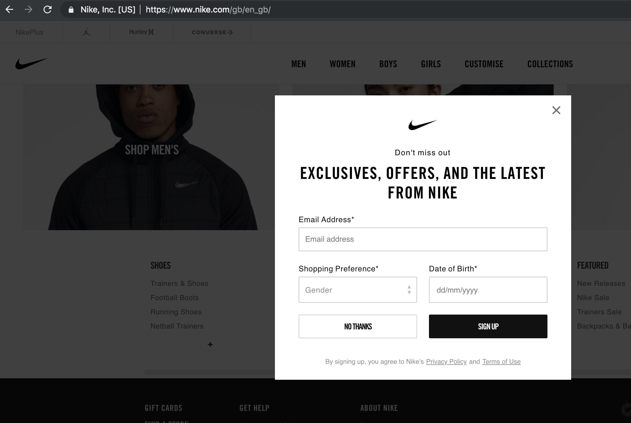
Don’t miss out

I could go on and on. There’s many more examples (“install our app to continue!”, “ding ding, our chat is offline “-popup crapbar), but I think you get the idea!

Trackers

This one is not really visible, except maybe from the very slowly loading progress bars, especially on mobile devices. Let’s call it the noise pollution of the internet. There’s even startups now to help track all the trackers you’ve installed. Clearly we need more trackers. Good thing you have that huge cookie banner so it’s all good.

I’m not sure how people get to these designs. Perhaps it starts with a brainstorming meeting where everyone shouts out their favorite analytics, A/B testing, or social media platform, and then they compromise by including all of them? It is because everyone else includes them? Because Facebook needs more data? There surely must be a trade-off where having more trackers installed causes less conversion than the additional data could help you optimize for. My bet is this tipping point is closer to zero and definitely lower than 161 requests (!), like the example from a tech newsite below.

A/B test yourself out of this one

As an industry, let’s just stop this madness! I don’t think anyone seriously looks at this and thinks: this makes things better for users, good to go, ship it. So let’s clean up the web in 2019 and make it fast and readable again. Then, hopefully someday, when our grandchildren surf the clear azure (/self-hosted) waters of the internet, the only proof of internet pollution that remains is the stories they read from the fast-loading websites that still tell about it. Without crapbars.

Email as a platform

Google just announced Actions in the Inbox.

By adding some markup (Microdata or JSON-LD) to the HTML emails you send out, Gmail can now display quick action buttons next to your email.

Some might see this as simply another random extension, or a Gmail gimmick à la Gmail Labs extensions. We rather see it as part of a trend in which communication channels and devices are changed into platforms supporting an entire “ecosystem of apps”. Mobile phones used to be for calling, emails used to be for sending someone a text message (and I guess sunglasses used to be for just protecting your eyes :). Not anymore. All these things have turned into platforms with many apps running on top. All this added functionality makes it much more interesting for consumers, and more exciting for developers to hack new apps on top of. The companies behind them of course know that they can win the real battles by having the better ecosystem (would you switch to Windows Phone if it doesn’t have your favorite YouTube app, or to Hotmail if it doesn’t have your Movies Info app).

Many people would agree that email as it works today just isn’t good enough anymore. People try to use it for much more than it was originally intended. It’s no longer just a way to send people a message, it’s also a todo list, a CRM application, a help desk, a way to organize events, split bills, and much more. Because of this, the way email works desperately needs to be changed, at least extended.

One approach is to completely reinvent email as we know it, Email 2.0. We think this is a step in the wrong direction. One famous example of a very cool but failed attempt is Google Wave. It’s exciting to work on these projects, and of course developers love to completely rewrite and reinvent things, but let’s not forget email is already very popular and it’s hard to make everybody switch. It’s also not needed, which brings us to the other alternative: there are many ways email can be extended with new (open!) standards. It’s called Actions now, but it might look more like complete “email apps” in the future. We already know people want to use their email more effectively, and in fact using some clever hacks, some “apps” were already built and proven to be popular (Rapportive, for example). Plus, as a platform, it’s already used before as a “human API” to build services on (like sending an email to trigger some action like creating a blog post, an invoice, or – like with a weekend project of ours – create an online form).

One of the reasons email is so popular is because it just works, everywhere. So of course we need to deal with things like mobile views and graceful degradation to make sure that remains to be the case. But a player like Gmail is big enough to take the first step into allowing developers to build more apps around email, using new, open standards. And I believe that with us many other developers would be happy to write them, and make email much more powerful and effective than it is today.

New in Papyrs: Navigation Widget, Google Calendar and more!

We’ve been working on quite some new features for Papyrs, time to introduce some of them!

Category Navigation widget

If you’re using categories to organize your Papyrs intranet pages, you might want to navigate your pages by category. At the Pages Overview, you can already find an overview of all your pages by category. We’re now releasing a new feature that allows you to add category navigation directly to any page. Different pages can show navigation controls for different categories. For example, if you have a page with information about a certain project, you can show “related pages” by adding a navigation widget that shows the other pages and (sub)categories in the project’s category.

You can add the Category navigation widget by adding a Navigation widget, and selecting the Categories option.


Updated Google Calendar integration

We redesigned the Google Calendar integration, and we think it looks really pretty now!

Quick reminder: you can add a Google Calendar by adding a Media Widget to your page, and then going to Google Widgets and selecting Calendar.

With Papyrs you can add Google Apps calendars and personal (gmail) calendars. Just authorize Papyrs to connect to the Google Calendar and we’ll take care of the rest.

The new calendar!


Calendar overview for the entire month (click to enlarge)


Viewing the week overview

Viewing the daily agenda

Time picker

We added a new control for time inputs on the forms you create with Papyrs. As before, you can type in the time yourself, but you can also quickly select one using the time-picker.

Search filters
You can now filter search results. This is handy especially if you have a lot of documents and files on Papyrs and you know what you’re looking for. If you’re only interested in pages, you can type "page: meeting notes" (without the quotes) and Papyrs will show matching Pages. If you’re looking for a file (a pdf file or word document perhaps), then you can simply type "file: idea" and you’re going to get a list of pdf files.

Here is the complete overview of the search filters Papyrs understands:

page: Search within pages
file: Search for attachments (attachments on pages as well as attachments on forms)
contact: Search for contacts and profiles
feed: Search for comments
form: Search for matching forms

I’m sure some of you noticed this these filters are exactly like the search filters in Google and GMail. Most people are familiar with filters like these already, so we think most people will get the hang of it quickly.

Sorting checklist filters

A small improvement to Checklists: you can now re-order the items on your list. Especially useful if you want to prioritize the items on your lists!

That’s it for today
Hope you like all the new features. And as always, more improvements are on the way!