February 2013 Update: We’ve added a way to import your pages from Backpack into Papyrs.
We just read on TheNextWeb that Backpack, a web app from 37signals is no longer accepting new signups. Existing users aren’t left out in the cold, but you can no longer sign up for their service. Backpack is pitched as an “Easy intranet for your business”. Much like our product Papyrs. So we have always considered Papyrs good alternative to Backpack because with both products you can create pages, organize your documents and discuss and plan everything about your organization in one place. Of course there are also plenty of differences. For instance, Backpack had a lot of functionality for calendars and reminders, whereas Papyrs allows far greater flexibility in the sort of pages you can create with anything from Web Forms to Twitter widgets. And as we explain below, we also have a very different vision about intranet software. Now that Backpack is being phased out one of our competitors is, for all intents and purposes, a thing of the past.

So why did 37signals decide to phase out Backpack?
They didn’t say exactly, but we can pretty much guess why. When you first launch a product it has only a few core features. A new product must do a few things, and it must do those few things really well. Then, as you continue working on your product and make improvements to it (based on the feedback you get from your initial customers) the number of features in the product grows slowly but steadily.
Suppose you start with 3 different products that solve 3 distinct problems. The first product is essentially a user-friendly wiki. Companies can dump all their internal documents on there so everybody stays on the same page. The second product is for project management: it has a calendar, tasks, timelines, and some index of active and archived projects. The third product is, let’s say, for collaborative text editing. Multiple people can work on a document simulaneously and see each other’s changes and annotations. So three products: a wiki, a project management tool and a collaborative document editor.
Initially all is great and these three products solve a different issue and everybody’s happy. Happy? Well, no, just *mostly* happy. Because the moment you have customers the feature requests keep rolling in and most feature requests are going to be pretty reasonable. Your users are going to want to have one login for the different products. They’re going to want one unified place where they can see all activity and updates. And if two out of three products have a calendar, why don’t the events of one product show up on the calendar of the other?
And so the apps converge…
Essentially, every time you add functionality the products become more alike. These web 2.0 productivity products naturally converge towards one-another. When you add tasks to the wiki-app, it becomes more like the project managing app. And when you add rich-text notes to the project manager app it becomes more like the wiki-app. The lines between the apps get blurred and if you’re not careful the apps you built that people love slowly grow into monstrosities that attempt to do everything and as a result become complex and clunky and altogether unappealing.
This is what we realized a little over a year ago when we started working on Papyrs. When it’s inevitable that users want a lot of functionality but all users want different functionality you need to make some hard choices. Even though you know you can’t keep everybody happy you still want to keep as many people as happy as you can.
We think there are two good solutions:
1) you figure out which features are most critical and you create a new app that combines the all best bits from the original 3 apps. You just focus on extreme simplicity and ruthlessly cut functionality across the board. This is what 37signals did and they launched Basecamp Next earlier this year. It has some of the functionality of Backpack, but not all. It also has most of the functionality of the original Basecamp, but not all.
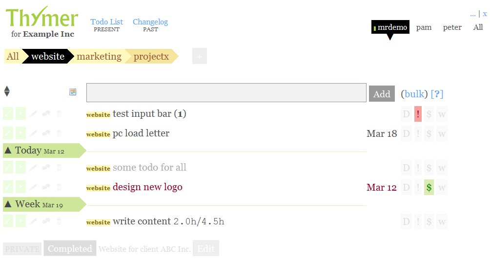
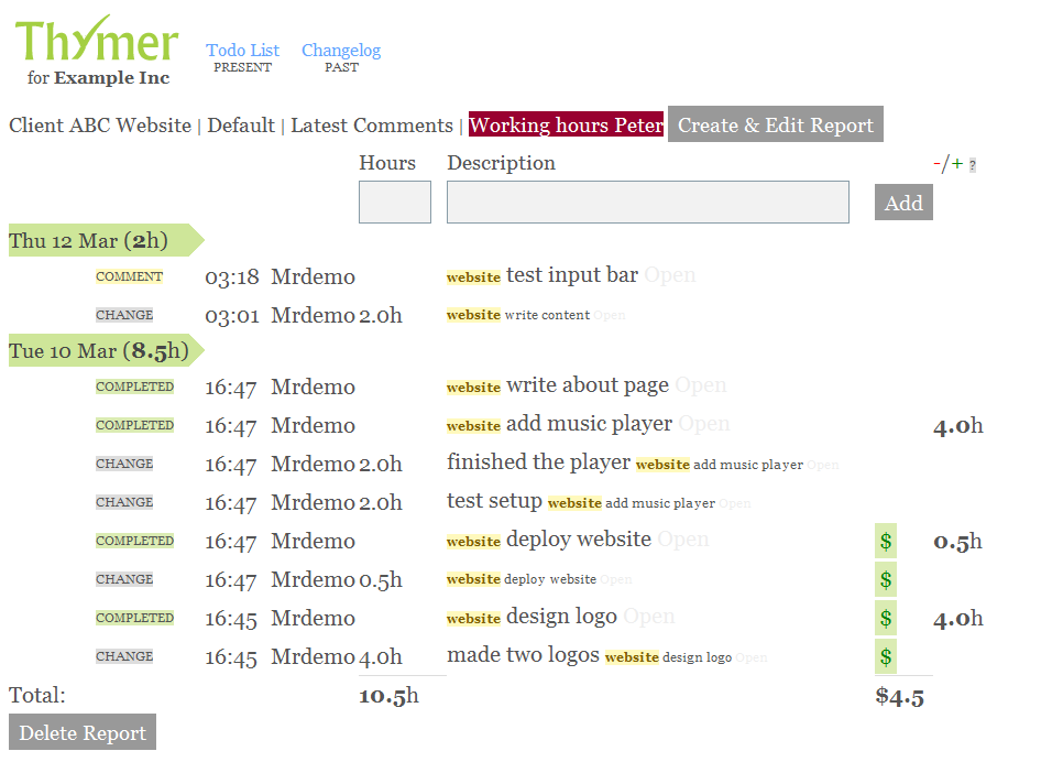
2) you create a product that maximizes flexibility and give users the choice which functionality they want to include. This is what we did with Papyrs. Because Papyrs pages are just made of simple widgets that people can just drag&drop onto a page. Our users use the widgets they need and ignore the ones they don’t. The collection of widgets available to them simply grows over time. We have all sorts of customers who use Papyrs in completely different ways. And because of our widget approach we can add functionality to widgets to make our customers happier without making the product more complex for newcomers.
Conclusion
So although we were a little surprised to see Backpack shutting down, it makes a lot of sense. When you have different products and you notice that they keep growing towards one another and get a lot of overlapping functionality you have to make some tough decisions. 37signals decided to create a new product that has most (but not all) of the functionality from their old products Basecamp and Backpack.
We decided with Papyrs to start with a platform that allows us to add functionality where needed without having to make sacrifices in usability. So hopefully we chose wisely and we won’t have to make a Papyrs Next a few years down the road :)