We consider our support one of the main “features” of our products. We try to respond as fast as possible, and we’re always curious to hear what you like and don’t like. Although the current feedback process seems to work well, we wanted to see if it could be improved even further.
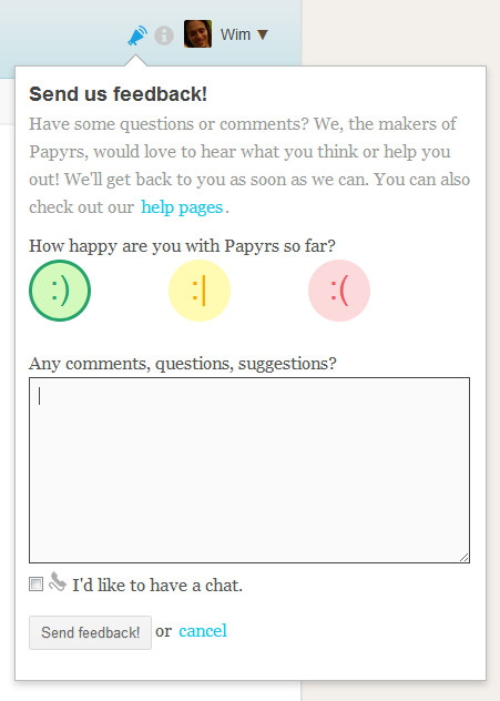
As an experiment, we redesigned the feedback dialog in Papyrs. There are several goals for the redesign. First of all we want to make it easier to access, so we get more feedback if people have questions or comments. To get a better sense of user satisfaction/overall happiness with using the product, we also added smiley icons. Most people already write things like “we like it!”, but as it only takes a second to select your mood, we expect to get an even better picture. Finally, we also added an option to talk to us directly. Though this is an experiment, we think it might be interesting for questions that would take too long to handle over email, and to get to know our customers better. Because our users are in so many different timezones, when you check the phone icon, we’ll contact you about a date and time that’s convenient for you and call you back.
Here’s the updated feedback dialog, we hope you like it!
