Today we’re announcing improved date separators for Thymer. Every day when we work on Thymer we make dozens of small decisions about the interface. Where to place buttons, what colors to pick, and much more. Every once in a while we have to make bigger decisions about the interface, decisions that have no obvious “right” solution. So today we thought: why not ask our users what they think?
So that’s what this blog post is going to be about. First we explain what the new feature is about, and then we’d like to hear which of the alternatives you like best.
The Feature
To plan your tasks, two date separators are currently visible in your task list: “Today” and “Week”. Right now, all tasks placed above the today separator are today’s work, all tasks placed between the Today and Week separators are due this week, and all tasks below the week separator are tasks you want to do eventually.
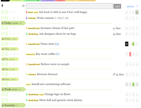
We’re now going to add more separators: one for every day of the week, one for tasks within 14 days, within 30 days and “Someday” (something GTD’ers should be familiar with). You can turn these separators on and off at any time in a new “Edit Date Separators” pane. Also new is the ability to collapse or expand sections of your task list. For example, collapsing the Someday section keeps your list short and lets you focus on your next actions.


The Alternatives
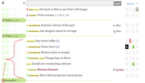
So, what about the alternatives? Currently, the tasks planned for a certain date appear above the separator (e.g. all tasks planned for today appear above the “Today” pointer, all tasks planned for Tuesday above the Tuesday pointer, etc.). If a section is collapsed, the items above are hidden. The options:
Alternative 1

Tasks planned for a certain date are above the separator. “Someday” will always be at the bottom of the list. Clicking the up arrow collapses the tasks in the section right above the separator. This approach makes Thymer more like a timeline where the Today separator marks the end of the list of tasks you want to do today, and marks the start of the tasks you want to do the rest of the week.
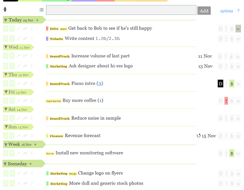
Alternative 2

Tasks planned for a certain date are below the separator. “Today” will always be at the top of the list. An extra “Someday” separator will mark the end of the planning for this “Week”. Clicking the down arrow collapses the tasks below the separator. This approach makes Thymer more like a calendar, where you find the tasks you want to do today under Today, the tasks you want to do this week under the Week separator and so on.
So what do you think?
- I strongly prefer tasks show above the separator (Alternative 1)
- I slightly prefer tasks show above the separator (Alternative 1)
- I strongly prefer tasks show below the separator (Alternative 2)
- I slightly prefer tasks show below the separator (Alternative 2)
- I don’t care
The easiest way to vote is to twitter us, email us or just leave a comment here: just send 1, 2, 3, 4 or 5 to @stunf, team@stunf.com or post it as a comment below. Thanks!
If you want to explain why you think one solution is superior, or if you have a completely different idea, let us know!
Available soon – Let us know which you like best!
This feature should make organizing your tasks even easier, and close the gap between a calendar and a task list even further. Let us know what you think, and we’ll launch this soon! (available for all plans, free & paid)
I strongly prefer tasks show below the separator (Alternative 2)
Thanks for the vote Karan!
I strongly prefer tasks show below the separator (Alternative 2).
I also am confused about the difference in the date on the separator and the one associated with the task. I don’t understand why one can move a task to any separator, but it preserves the same date.
I slightly prefer tasks show above the separator (Alternative 1). Somehow I got used to this approach.
Thanks for voting Sean and Stephan.
A common situation is where you have a dozen tasks due on Friday, but none due on Monday and Tuesday. In that case you can safely schedule some of the tasks to the beginning of the week, without losing track of the real deadlines.
When new tasks pop up throughout the week you can immediately see if you’re going to have time for them this week because the schedule is already made. If you don’t plan ahead which tasks you want to do on which day of the week you can easily get into a “last minute panic” because you won’t notice tasks have been piling up. When Friday morning comes you realize that you can’t possibly get even half of the tasks on the list done. Essentially, the schedule you make by drag-and-dropping tasks reflects when you plan on doing what. And that’s only loosely related to the actual deadlines.
Hope that explains our philosophy :)
I’ll go for 3 (strongly for tasks being put below the separator).
It seems extremely intuitive for me to first see the day header and then what is planned for it. It adds a lot of readability, especially at the beginning of the timeline. (want to first see “Today” and then see the todo’s for today instead of first seeing the todo’s and then seeing Today.
This layout might lead the way of other interesting features, such as Sticky Todo’s (things that you might want to keep on your mind even when they are planned far up ahead). You might want to do drag and drop them throughout, still you see them every day at the top of your todo list.
Alternative 6:
Put BOTH settings in the settings menu!!!
Edit: Sorry, I mean Alternative 3.
3 please :-)
3. with a suggestion – make it visually so the date ‘holds its items’ somehow, so it’s more intuitive.
I’d go for alternative 2 as well. The first time I used Thymer I was confused by exactly this choice. Gotten used to it however so I slightly prefer alternative 2 :)
Both. But default should be:
2. I slightly prefer tasks show above the separator (Alternative 1)
This might not be clear for new users however. Restyle the seperator to indicate more strongly it relates to the content above and not below. (a 0..5% fade for these items?)
I’ll say 4 but I could live with both.
3
I’ve got to go with 3, too, with a definite yes please. It’s a scanning thing, really, with the separators acting as titles.
Like the Someday option too.
Thanks for voting everybody!
Option 3 is the favorite by far so that makes the decision easy for us. We’ll launch the new seperators in a couple of days.
1 please!
I’ll prefer option 1.