2010

It’s been a few weeks since our last post, as we’ve mainly been making some changes under the hood. Amongst the many small fixes, one of the changes you might notice most is that we optimized the search function.  New tasks and changes are now searchable immediately.

Of course we’ve also been working on new features. Rather than looking back on last year, we’d like to give you a hint of some things to come in the first few months of 2010!

Improved Time Tracking & Billing
ttrack_small

The time tracking control will make it even easier to keep track of your time: the timer can be paused, and resumed as you switch between tasks. We’re also adding support for (hourly) rates so you can use reports to keep track of your project budgets. We expect to launch this feature within the next few weeks.

iPhone version
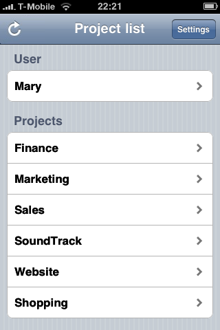
We all want to access Thymer on the go, so an iPhone optimized version is in development.

IMG_0123

Team improvements
Currently, two major improvements are planned. First of all, we’re going to add a way for people with professional accounts to work together. Secondly, we’re going to add an additional restricted user level. The users will have very limited rights and will not count as full team members (meaning they also won’t count for your team’s user limit). This account type can be used to invite clients to comment on and keep track of projects they are involved in.

API
We’re still working out the details but we’re quite excited about the possibilities of linking Thymer to other applications and vice versa.

.. and much more
We have many more plans and we’re really happy with the support so far. That’s why one of our activities this month was sending you a thank you!

cards2

Coffee, ink and cards

cards1

Pile 1 of many ;)
Happy holidays and a happy new year everybody!

New Feature: Improved Date Separators make planning easier

We’re glad to announce a new feature today. A little while back we put up a poll to ask your opinion on what this feature should look like. The outcome was pretty clear, so we got to work. This feature will make it easier to create a more detailed schedule for your tasks, and allows you to focus on the most important parts on the list. It’s now available for all plans, free and paid.

Calendar meets task list
The poll question was about the order in which the date separators and tasks are shown. Should we first display the date separator, followed by the tasks planned for this day/period, or, should we leave the order untouched and first show the tasks and then the separator. It turned out the majority preferred the date to be displayed first, like a regular calendar.

week

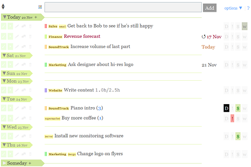
More date separators (Weekdays, Within two weeks, Month and Someday)
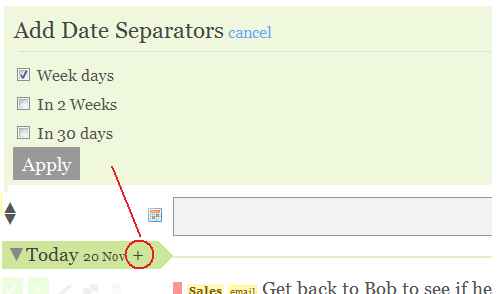
Before there were two “date separators” – Today & This Week – that could be dragged up and down, thereby creating a schedule for your tasks. We are now adding the option to add more of these separators: one for every day of the week, within two weeks, within 30 days and “someday”. This will allow you to create a more detailed planning for the upcoming week. It also enables you to put tasks that require no immediate action further back, into the new Someday section. Which separators you want to show can be changed easily. If simply dividing your tasks between today, this week or someday is enough, and the rest just feels unnecessary to you, then you can leave your settings untouched. If you’d prefer to make a more detailed schedule, you can simply select the separators you want to add, using the new Add Date Separator menu.
separators

Collapse and expand sections

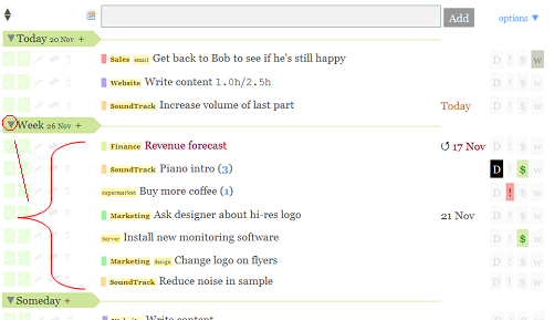
collapselist

Usually not all tasks require immediate action. Some might have a deadline, but not until a few weeks from now, so the tasks are not of immediate concern. You’ll probably also have a bunch of tasks that you want to do eventually, but you have no idea when. You can now place those tasks in the “someday” section and forget about them. In that case you may want to a weekly review of those tasks, and see which have become more important or urgent, and drag those up.

Most Thymer users add more tasks to Thymer than they complete (and we’re no exception), so every week the task list grows longer and longer. That’s why we’re now introducing an option to collapse and expand the different date sections on your task list, as marked by the date separators. If you click on the black triangle next to Today, Someday or any other separator, that section will be collapsed. Just toggle the triangle to show that part of your list again. As before, tasks with due dates are moved up to their corresponding date section every night, so even if you leave your Someday section collapsed, the tasks that are due soon will eventually float to the top of your list. Thymer will remember which parts of the list you’ve collapsed.

@someday
To quickly add a task to the bottom of the list, we already introduced the @last tag before (e.g “Some task @last”). We’re now introducing the @someday tag. It is similar to @last, but instead of adding the task to the bottom of the list, it will put the task at the top of your Someday section.

What’s next
As announced earlier, we’re currently finishing a first iPhone version of Thymer. We’re also working on many new other features, ranging from managing project time budgets to collaborating with clients, but more about that later. For now, hope you’ll enjoy the new features and have a nice weekend.

New feature design – your opinion needed!

Today we’re announcing improved date separators for Thymer. Every day when we work on Thymer we make dozens of small decisions about the interface. Where to place buttons, what colors to pick, and much more. Every once in a while we have to make bigger decisions about the interface, decisions that have no obvious “right” solution. So today we thought: why not ask our users what they think?

So that’s what this blog post is going to be about. First we explain what the new feature is about, and then we’d like to hear which of the alternatives you like best.

The Feature
To plan your tasks, two date separators are currently visible in your task list: “Today” and “Week”. Right now, all tasks placed above the today separator are today’s work, all tasks placed between the Today and Week separators are due this week, and all tasks below the week separator are tasks you want to do eventually.

We’re now going to add more separators: one for every day of the week, one for tasks within 14 days, within 30 days and “Someday” (something GTD’ers should be familiar with). You can turn these separators on and off at any time in a new “Edit Date Separators” pane. Also new is the ability to collapse or expand sections of your task list. For example, collapsing the Someday section keeps your list short and lets you focus on your next actions.

Task list with an additional Someday separator

Task list with an additional Someday separator.

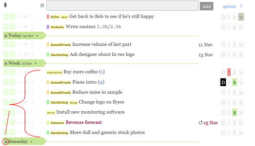
The same task list, with the Someday section collapsed.

The same task list, with the Someday section collapsed.

The Alternatives
So, what about the alternatives? Currently, the tasks planned for a certain date appear above the separator (e.g. all tasks planned for today appear above the “Today” pointer, all tasks planned for Tuesday above the Tuesday pointer, etc.). If a section is collapsed, the items above are hidden. The options:

Alternative 1

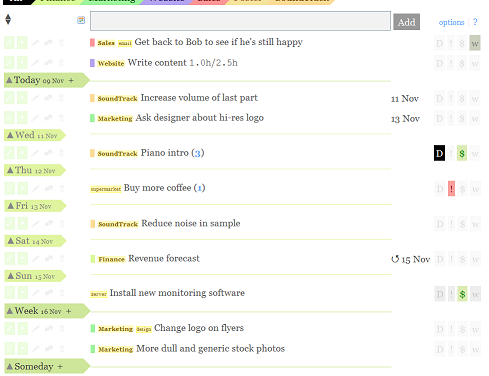
Alternative 1 - Tasks followed by date separator

Tasks planned for a certain date are above the separator. “Someday” will always be at the bottom of the list. Clicking the up arrow collapses the tasks in the section right above the separator. This approach makes Thymer more like a timeline where the Today separator marks the end of the list of tasks you want to do today, and marks the start of the tasks you want to do the rest of the week.

Alternative 2

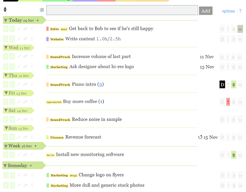
Alternative 2 - Date separators followed by tasks

Tasks planned for a certain date are below the separator. “Today” will always be at the top of the list. An extra “Someday” separator will mark the end of the planning for this “Week”. Clicking the down arrow collapses the tasks below the separator. This approach makes Thymer more like a calendar, where you find the tasks you want to do today under Today, the tasks you want to do this week under the Week separator and so on.

So what do you think?

  1. I strongly prefer tasks show above the separator (Alternative 1)
  2. I slightly prefer tasks show above the separator (Alternative 1)
  3. I strongly prefer tasks show below the separator (Alternative 2)
  4. I slightly prefer tasks show below the separator (Alternative 2)
  5. I don’t care

The easiest way to vote is to twitter us, email us or just leave a comment here: just send 1, 2, 3, 4 or 5 to @stunf, team@stunf.com or post it as a comment below. Thanks!

If you want to explain why you think one solution is superior, or if you have a completely different idea, let us know!

Available soon – Let us know which you like best!
This feature should make organizing your tasks even easier, and close the gap between a calendar and a task list even further. Let us know what you think, and we’ll launch this soon! (available for all plans, free & paid)

Launch – The Week After

Hi there! Now the first storm of feedback has settled, we found some time to reflect and write up a “The Week After” story. But why make this public? Well, we’ve always been inspired and learned a lot reading about how fellow startuppers launched their companies, like Peldi from Balsamiq, who has been very transparent and covered every step of launching a cool app called Mockups. In that spirit we’d thought we share with you what our process has been so far.

In short: it’s been really busy and great! The launch went better than we expected, 7 minutes after going live we got our first customer! As with our beta launch we got a lot of nice reactions, thanks everyone! We got over 60 subscriptions in the first week (but more users, as some customers are a team), including families, hobbyists, independent contractors, companies, and other organizations such as charities.

So, let’s get to the numbers:
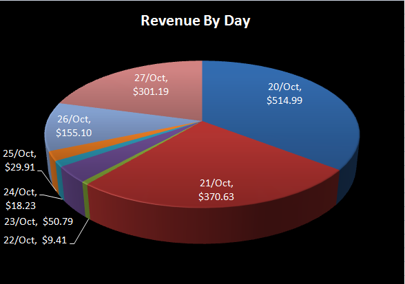
VAT not included

We had sales every single day, and that was a big relief. We knew big fluctuations between day to day sales numbers are to be expected, but we didn’t expect the first and last two days of the first week to bring in 80% of all sales.
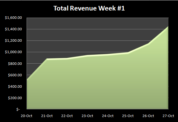
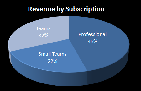
Cannot resist temptation to extrapolate.

I wonder if the graph will look similar a few months down the road.

We’re really happy about this!

Road to the launch
To give some more insight into how we went from idea to launch, this is roughly what we’ve been through in the past year and a half.

Idea (Summer 2008)
Before Thymer we’ve been working on other projects, and it’s always been challenging to keep a good overview of our responsibilities and keep track of what’s going on, especially as we were usually working from different cities and countries. Of course we tried every product for task and project management we could find, but none of them felt right for us. So we developed our own ideas about what we really wanted the software to do and asked ourselves if maybe this would be a nice product for other people to use as well. We didn’t want to become too distracted though (eventually the other project didn’t really work out, but that’s a different story), but our hands were itching and it became a little side-project… So, during the summer we made a lot of sketches about what the system might look like. We still weren’t too convinced it was worth turning this into a product. Inspired by the Four Hour Work Week-approach (the first sketches and brainstorming happened somewhere on the beach), we decided we would only create a very limited prototype, launch a demo video, and see what happens.

Demo video / Splash page (October 2nd, 2008)
The prototype was ready (ready enough to make a video about it, not to use it :) and we made a demo video. We put up a splash page with a description about Thymer, the screencast and an input box for collecting email addresses for interested people. We were very happy about receiving the first 50 email addresses of interested people almost right away. We got some very nice feedback from the start, which encouraged us to develop it further. For months we spent days and nights working very hard to go from a prototype to a beta product we hoped people would love to use. At this point we thought we would be only a couple of months away from a commercial launch.

Sneak Preview (very limited beta) (March 2009)
In March our beta list (people who signed up for the beta) grew to thousands of addresses, and we decided to send out a first small batch, to see what the initial reactions would be and to see if any weird problems would arise (nope, none did). Again, lots of positive feedback and lots of suggestions for improvement. We decided to polish Thymer a bit more, before we would invite everybody on the list into our private beta. You only have one opportunity to make a first impression after all. Launch not too early, launch often; so to speak.

Private Beta (May 2009)
We launched our private beta and sent out emails to some blogs if they were interested in giving Thymer a try; we also included beta keys for their readers. We got quite some press and thousands of visitors, who all wanted to try the beta! We also got mentioned in a paper magazine (.net developers). For some reason seeing Thymer mentioned on a big blog and in a paper magazine made it feel so surreal.

Preparing for launch (Jul – Oct 2009)
With many beta users using Thymer, we got quite some feedback, thanks again everyone! More and more people found their way to our beta list, as we were mentioned more on other blogs and twitter. Now the crucial question: would enough people love Thymer enough to actually pay for it? So far the feedback was great, but of course we need paying customers to survive. During the months leading up to the launch we worked on adding many features (features we were missing ourselves and features that were requested often). Next to all the coding, we worked out pricing plans and our subscription backend. A phase with more questions than answers: “Is the price right?”, “Is it easy enough to change from a beta to a free or paid plan?”. We kept testing and refining, and finally decided it was really time to find out: launch! And that brings us to where we are right now.

Our goals
We’re ecstatic about our start, and the feedback and sales are really encouraging! In the next few months we hope to become ramen profitable (meaning we make just enough to cover basic living expenses and operating costs for Thymer). This would open up all kinds of new possibilities, like, maybe, an upgrade for our company transportation:

Vrrrroooooooooooommmmmm! F

Taken last year in front of my apartment. Winter is around the corner, so we better hurry :)

What’s Next
So what are we working on now? This week we’re launching a major new feature, making it easier to plan and manage longer task lists. And, we have some more news about the iPhone version. Other features are also in the pipeline, more about that soon!

Thymer is Beta no More!

It's the the twin STEREO (Solar TErrestrial RElations Observatory) spacecraft, in case you're wondering.

We’re launching!

Since we started our Private Beta back in early April this year Thymer has come a long way. We’ve added many features (Team Support, Permissions, Search, Email notifications, Twitter Integration and much more) and we’ve fixed countless of bugs. And now finally, we’re think we’re ready to remove the Beta label.

But first, some new features!

Branding

acne_login

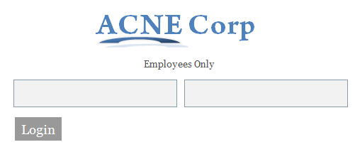
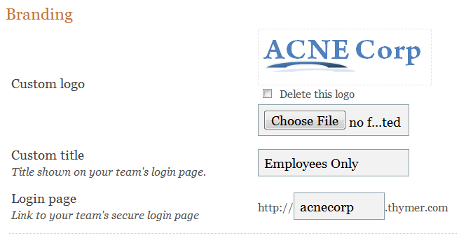
You can now change the appearance of Thymer to make it fit better in your organization. You can put your own logo in the top left corner, add text to the log in screen, and you even get to pick own subdomain. In this example, http://acnecorp.thymer.com

branding

SSL

now_with_ssl
The more people rely on the Thymer, the more important a secure connection to our servers becomes. So from now on users can access Thymer securely via SSL.

New Website

What can I say? It really speaks for itself (if it doesn’t — we’re doing something wrong)! It has a feature tour, buzz page and a page where we explain all the different subscriptions.

Subscription Plans

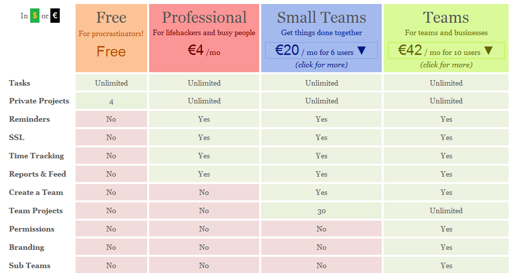
Last but not least — you can now order (and pay for) Thymer! There are at the moment 4 different kinds of subscriptions. Professional, Small Team, Team, and Free. Of course, we also have a comparison page between of different subscriptions. See screen shot below.

prices

What happens to us Beta users?

You’ll get an email today and a page will pop up the first time you log in. In short: you get an extra fully-featured 30 days to either pick a subscription or a Free Account. Sign ups within 7 days get an extra lifetime discount.

So what’s next?

To start with? An iPhone version, iCal and Google Calendar integration, API access, integration with 3rd party services, and much more. We have only just begun!